I’ve now had the Google Pixel 2 XL in my pocket for about 90 days, and my experience has inspired me to write a review. This is not sponsored; I paid for this phone with my own money. Everything that follows is my actual opinion, and maybe a little fanboying. I’ll cover everything I have to say in two parts: the Tangible and the Intangible.
Disclaimer: The graphics you’ll see are made by me, and aren’t exactly 1:1. I created them in Logoist 3, which is my favorite graphic design software. I also tend to use Pixelmator and Photoshop, but Logoist is my favorite.
—-
Let’s start with the most obviously tangible part of the phone: the screen. My XL sports a 6”, LG-made pOLED panel. OLEDs rock because they have unique abilities. Firstly, black-colored content on the screen actually turns those pixels off. The result is a contrast ratio of 100,000:1. The pictures you take, the videos you watch, and the games you play will look spectacular on the Pixel 2 and 2 XL.
LED panels’ ability to turn pixels off also means they use less battery. A small part of the screen could theoretically always be on. Enter the Always-On Display feature, which does just that. Sleeping the Pixel 2 and 2XL still keeps on a part of the screen to show relevant information. It saves even more battery because I don’t need to turn on the screen as often. OLED panels make for the perfect intersection of form and function.
Onto the resolution. It’s a 1440 x 2880 panel, at about 538 pixels per inch. That’s a hundred more ppi than the iPhone X, and seventeen more than the Galaxy Note8. This isn’t noticeable at an arm’s length away, but it does mean VR experiences look better, if you’re into that.
Now, we can’t talk about the Pixel 2 XL screen without talking about the screen controversy: firstly, the screwy colors upon release. Reds looked brown, greens looked brown, blues looked…brown. Google’s software team decided to restrict the perfectly capable screen to only show “natural” colors, to look more accurate to real life. The problem? Users don’t want accuracy. We want saturation. So, when Google released a “Saturated” color mode option, I turned it on and I haven’t looked back. Brighter is better, and Google learned that the hard way.
Unfortunately, the controversy doesn’t end there. There’s a hardware problem with some OLED panels, too, called blue-shift. Essentially, the screen looks bluer if you look at it from an angle. It’s not great, but for me it’s no big deal. Blue-shift doesn’t mean the screen is broken, and the shift is nonexistent when you use the phone normally. For the record, neither the saturation nor the blue-shift issues apply to the smaller Pixel 2, which has a Samsung-made AMOLED panel. Though, the smaller Pixel has enormous bezels.

Meanwhile, the bezels on the XL variant are small (as you can see), following the recent smartphone trend. Usually display drivers go in the bezels, but manufacturers are finding ways around that. Samsung, for example, builds their AMOLED panels on plastic substrates to make flexible screens. They can then curve the panel over the edges of the body, like you see with their current phones. Apple shrunk the X’s bezels by taking that flexible Samsung panel and folding back the bottom of it to hide those drivers. Pretty clever.
The XL’s bezels are certainly not iPhone X-level, but Google did at least put front-facing speakers in them. Take note, smartphone manufacturers; speakers should face the user! The XL’s are so loud I seldom need to turn them all the way up. Unfortunately, sound does distort a little at 100%, depending on what I’m listening to. Not a deal breaker, but not what I’d expect from an $850 device.
Big speakers tend to mean big risk of water damage. Luckily, with the Pixels’ IP67 rating, spills are no problem. Even submersion is fine for a half hour at a meter deep. I haven’t tested the extremes because I like the Pixel too much to risk pushing the limits, but I haven’t had any problem bringing it into the shower or washing it off in the sink. You don’t have to worry about frying your internals with regular use.
Let’s delve deeper into those precious internals. Specifically, Qualcomm’s Snapdragon 835 and Google’s own Pixel Visual Core. The Pixel 2’s chipset is the Snapdragon 835. It utilizes a new 10nm node design, following last year’s 821 processor with 14nm nodes. I’m no expert, but I do know that smaller nodes in a given space mean more of them, which means greater power and efficiency. When paired with 4GB of RAM, the load on that chipset is lessened even further. Some phones these days do have 6GB RAM, but it’s more about software optimization than brute force, as anyone over at Apple will tell you. Heck, the iPhone 8 has 2GB RAM and is ridiculously powerful!
Meanwhile, the Pixel Visual Core is Google’s first homemade chip. They teamed up with Intel to make a powerful processor just for taking pictures. It came installed (though dormant) in every Pixel 2 device. With the recent rollout of Android 8.1, the PVC has been turned on. It now takes on all the Machine Learning (ML) and HDR+ camera data to ease the strain on the 835 in apps like Snapchat and Instagram. Snapchat doesn’t suck anymore on Android! Throwing that 8-core dedicated image processor on top of an 8-core CPU results in smoothness and beautiful snaps. Paired with a 3520mAh battery alongside these efficient and powerful processors, the XL lasts me at least all day. The difference with PVC is not only noticeable, it’s game-changing.
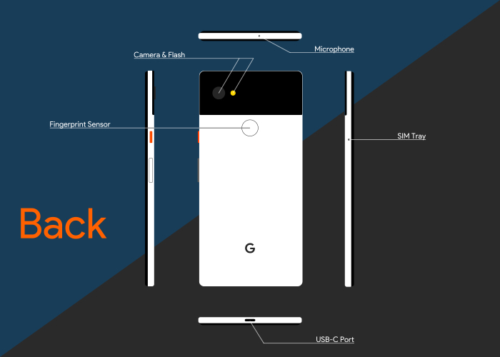
Housing all these great internals is the chassis itself. The outside of the phone is just as important as the inside, as Google well knows. Smartphone hardware design is essentially brand new to them, though. With the first Pixel phones, function was definitely placed ahead of form, and some argue there was no emphasis on form at all. This changed in July 2016, when Google appointed Ivy Ross as Head of Hardware Design. She and her team are responsible for the light, fun, blend-in-yet-stand-out designs we see on the Google Homes, Daydream headsets, Pixel Buds, and the Pixel 2s. Ross is all about function and form distilled, with a bit of fun and discovery thrown in, as she’s said before (Source: Design Milk). I seriously love it, and I’d kill to be a part of it.
The crux of her philosophy is visible in one place more than any other on the Panda White XL: the orange power button. It adds nothing to the literal experience of the phone, but style points go way up, and fun factor and uniqueness go up with it. It’s also been very well received by many critics.
Ivy has said that she does this to blur the line between technology and object. Each feature on the XL has its own room to breathe. The Panda White one stands out and yet fits in all at once. That’s no easy feat.
Playful within the confines of supreme functionality is how I would describe the design language. The ceramic fingerprint scanner is in the most comfortable position and is lightning-quick. All the buttons are clicky and responsive. Plus, each one has its own personality. Playful orange plastic for the power, and sleek chamfered silver-and-white aluminum for the volume keys. The XL is absolutely gorgeous naked and feels just as good in the hand. It has an aluminum body, with a coating that discourages fingerprints and slippage. It also further blurs the line between tech and toy. Ivy and her team have done a phenomenal job at making premium materials more like a necessity. They held “standard” to a higher standard, and that really shows with this device.
I cannot overstate the uniqueness of my Pixel, and how seamlessly the hardware integrates with the software. It feels almost magical. And it doesn’t even end there!
Review Part 2: The Intangible
