What happens when a company does great things, but the environment it has found itself in begins to misrepresent it?
Change.
This is the process MATCH NM is undergoing. MATCH is a non-profit organization based in New Mexico which employs college students to help underprivileged children how to read. Illiteracy plagues New Mexico communities, and not enough is being done to remedy the situation. So MATCH (which stands for “Mentoring and Tutoring Create Hope”) has been helping this for a little over a decade.
So, what’s the problem? Well, go search “Match NM” on Google. The first thing you’ll see is an ad for match.com, a dating website. MATCH NM expressed a need to change their image to something a little more unique, to set themselves apart from the dating site, both online and offline.
When I went to visit New Mexico a few months ago, I was approached by my grandfather with this rebranding idea and I immediately got to work. At an impromptu meeting with him and another board member, we all began saying what this organization was all about, and I started thinking of making a combination of the two words read and teach, since that’s what MATCH does.
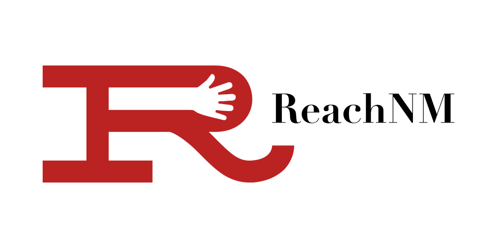
I came up with ReachNM as the name, and the board members that were told about the idea all loved it. I worked on different logo iterations and came up with this:
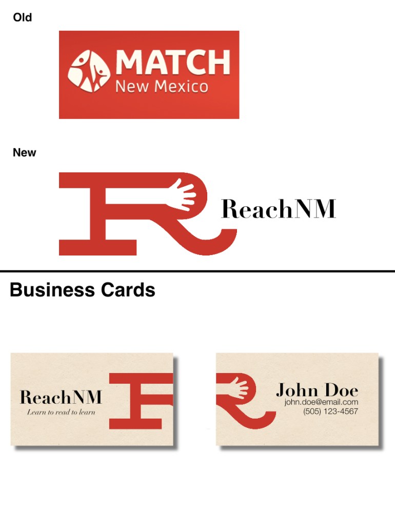
I personally think a brand should be named as simply as possible. The logo should be clear and concise and not complicated. So I placed a small arm in the capital R, reaching out. The reaching imagery is huge to the organization for many reasons, as I laid out in my pitch:
“The children are reaching out for help, the college students are reaching out to help, and we are reaching toward a brighter future together. To reach is to aspire (reach for the stars), but to reach is also to accomplish (reach the finish line). If you ask me, it’s a perfect fit.
“The imagery of reaching, as well as the word itself, evoke emotions and an idea of progress, movement forward. The logo, of course, is meant to reflect this. And the business cards take this to the next level by having the logo itself wrapping around the card, reaching beyond the borders.”
We’re still in the process of working out the kinks, and progress is slow, but this is the first time I’ve been tasked with rebranding. So it’s special to me, as is the cause!
—
If you want to donate to this incredible cause, follow this link and let them know!
