Sometimes, stuff just comes together right away. Simplicity wins out over ornateness, tweaks outdo fundamental alterations.
This is a weird feeling for me, when stuff comes together that way. It feels, I don’t know, undeserved? Too good to be true? Almost anticlimactic, but none of this is bad, as bad as it does admittedly sound. It’s just surprising, mostly.
This happened to me just recently. A friend of mine, a rapper and performer and waiter by my college, heard I enjoy logo design and typography. He asked me one night to design a logo for him, and the next day I set out to give him a few options.
I began with a few design languages I thought he might like, to get an idea of where his head was with regard to his personal brand. His bars (the ones in his songs, not the one at his restaurant) are rich and punchy and clever, and his raspy voice almost reminds me of Nyck Caution, with the mind of Anti-Lilly. So, yeah. Pretty amazing.
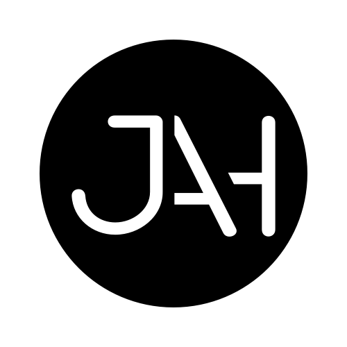
I made one grungy, almost graffiti-looking logo, with a crown over the J in JAH, for the quintessential “hard” look hip hop tends to embody. I also made a nice bubble letter JAH, which felt more soulful and light, but I wasn’t sure that was totally his vibe. It was clever enough and stylish enough, though, so I kept it in. Didn’t expect him to pick it. And then the third design idea I sent him was extremely minimal. Very much how I like my designs, and I find that genre of design language to be more and more prevalent today in lots of branding. But since you’re giving yourself fewer graphics and less complexity to work with, minimal logos almost have to be a bit provocative. They need to do a hell of a lot more with all that less-ness.
You can see it in Hillary Clinton’s campaign logo (made by Pentagon’s Michael Beirut, one of my favorite designers). It’s so simple, it could literally have been done by a five year old (though that’s something Beirut likes, and I happen to feel the same way). It’s a right-facing arrow crossing the capital H for Hillary. It welds the idea of Hillary Clinton to the idea of forwardness, of progress. In the same way that invisible arrow in the FedEx logo provokes that idea. We’ve all seen it! Or Barack Obama’s logo, the image of a sunrise being superimposed in a capital O, to suggest a new day is over the horizon, and it starts with Obama.
If you want to give an immediate impression of a person, sometimes it’s best to make it simple and glance-able, but also visceral. Scalability is paramount, too, which of course affects how much meaningful detail you can get away with. Your logo needs to fit on a business card and a billboard. Small graphics can make a big impact.
Anyway, the third logo idea I sent Jah, as a rough rough draft, an example of what I could design for him, ended up being the one. I asked him if he thought it needed anything, any embellishments at all, and he cam back with “nope, that’s it. I want that.”
I was done. After my first try. That hasn’t happened before. I was so ready to get started on making a dozen different logos, trying out scores of unique fonts, and working with layering and shaping. But apparently he knew exactly what he wanted, and minimalism won out.
I like all the letters in Jah, and line-oriented letters as a whole. I know that sounds weird, but they’re so much fun to play with. The right side of the J is a line, and the left sides of A and H are also straight lines, so I like to cut out the common denominator and make it one cohesive-ish image. It’s mathematical, y’know? And, as my currently developing passion reminds me every day, math is incredibly beautiful and can make enormous impacts on what we do and how we do.
I’m excited for Jah to blow up, and I hope this is just the beginning of his and my artistic journeys. Perhaps someone in need of their own logo will ask him who designed his…
…I should make a business card for myself.
Stay tuned!

Hi Jeremy! Your fan here from Charlotte, NC… 🙂 This is another great post!. Not only you are a talented logo designer, but also a talented writer and storyteller. I enjoy the naturalness of your stories and I can hear the passion about your work. I was out of town last week and while relaxing in my room I started to browse my Evernote articles and inspirational materials, and came across my favorite quote from your Awake/Aware post “Being awake is about action, and being aware is about intention. Without thoughtful attention and calculated action, how can anyone get anywhere? “. Last night I was back in town and checked my emails, and there was a new post from you! I was delighted to read it!. I truly enjoy your work. I look forward to more interesting posts from you. (Perhaps, we could chat in the not-so-distant future, if you schedule permits it. I have some ideas that I would love to share with you and hear your point of view.) Keep up the great work!
LikeLike
Sonia, your kind words never fail to convince me I’m growing as an artist, and that I make good content. Thank you so much! I truly believe the story is just as important as the destination, so it’s important to me that I provide context, progress, and process in all my posts. As for connecting about ideas you have, reach out any time and I’d be happy to talk design with you!! It’d truly be a pleasure. Thanks again for the love!
LikeLike